
I am not a designer, but something has stuck with me over the years.
Start from what you already have
Ideally, you’d have brand guidelines with everything defined, but sometimes you only have a few pieces or design clues, like a brochure or a logo.
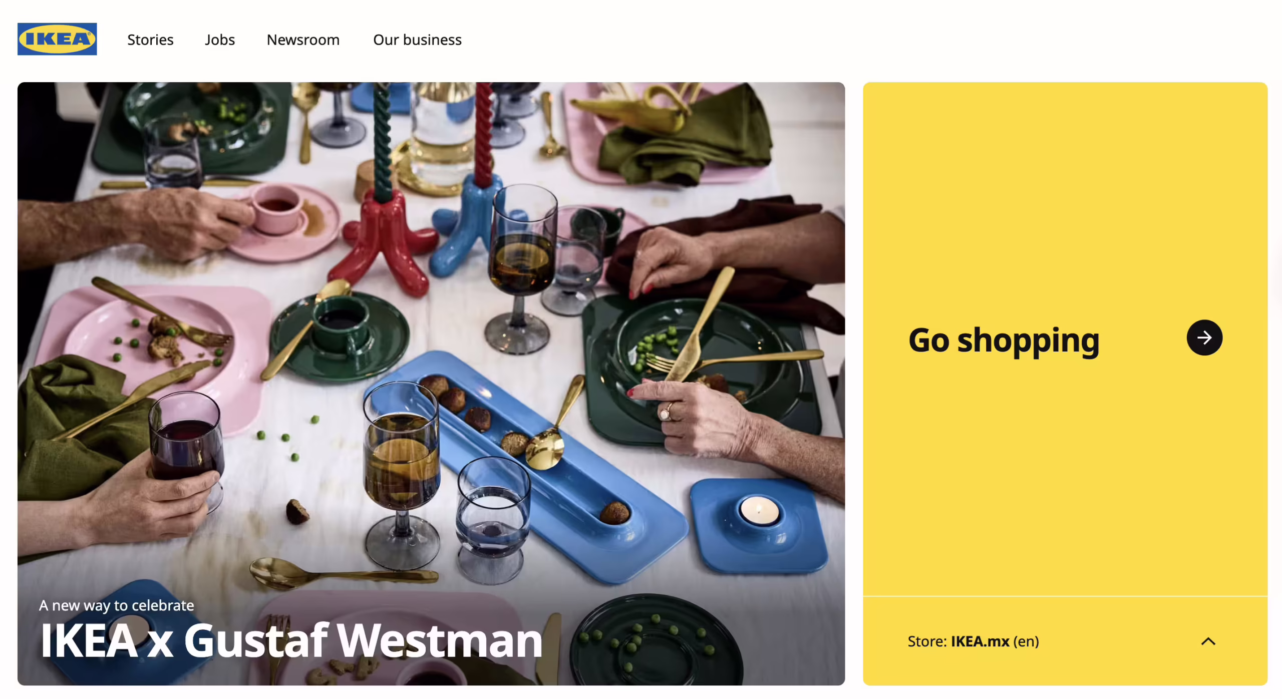
Do you have a logo available?
That is an immense quality asset that gives you a lot of information about the brand vibe, colors, shapes, textures, and fonts.
If you don’t know how to read these, ask AI to help you analyze them.
For example, the IKEA logo teaches web designers:
- Use color intentionally — blue for trust, yellow for warmth.
- Keep typography bold and legible.
- Favor structure and simplicity over ornament.
- Maintain consistency for lasting recognition.
- Design for everyone, not just aesthetics.
If you don’t incorporate your design elements, they will stay disconnected and not be part of the website.
If you only have a basic mood and don’t dedicate enough time, you’ll probably create a generic website.
Aim for the elements to build a unified experience.
Do you have any text or media?
Custom text, images, or video can tell you a story.
Slogans can help you with how the brand wants to sound. Serious? Friendly? Professional? Classic?
Listen to that voice to decide how web elements will look. For example, consider the text’s uppercase or lowercase, personal or corporate typography, and rounded or sharp shapes. Thin, bold, large or small, colorful or vintage.
If the website mainly showcases media, make it stand out! Use full-width images, background videos, or galleries with big thumbnails.
If you’re redesigning, consider how you can better present the elements. Provide more space or rearrange them.
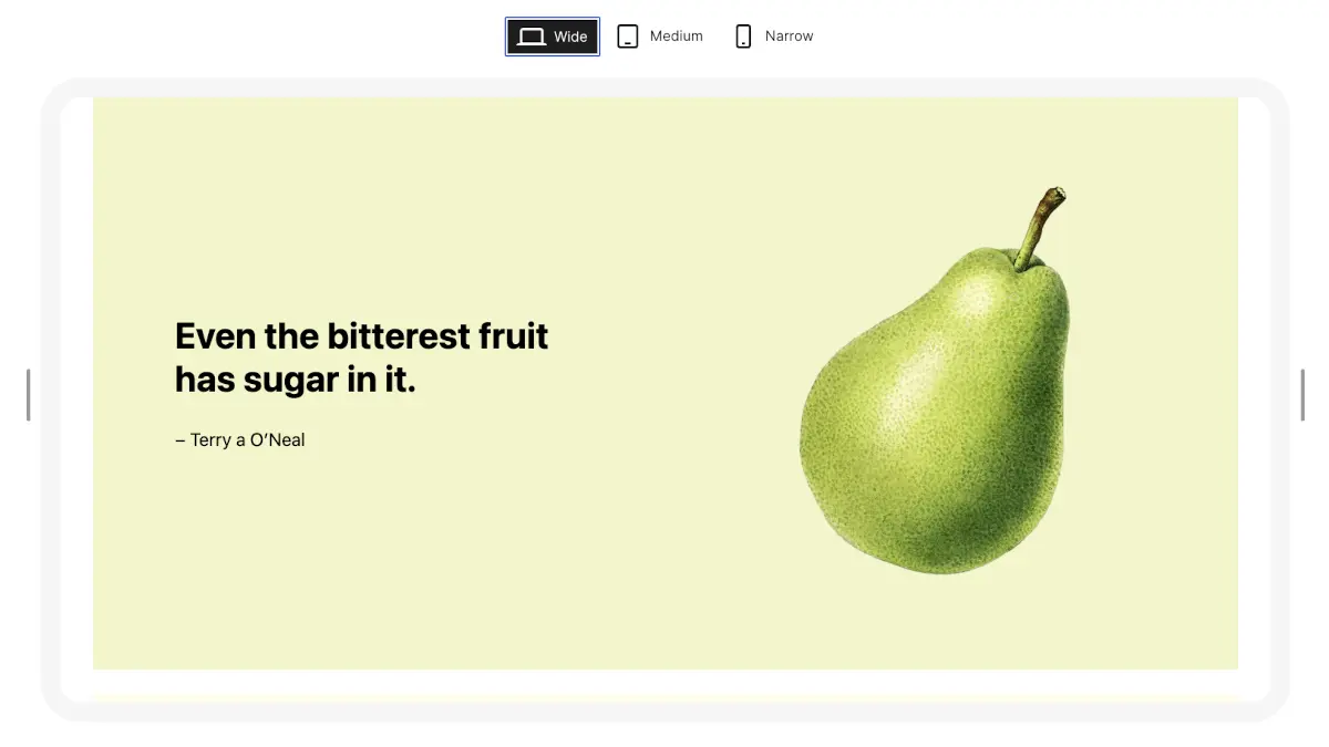
If images look very similar, don’t present them on the same page; that can be boring. Every image deserves its place.
If you don’t have anything, you’ll always have patterns
Well-designed patterns can help you start solidly.
Design patterns give you a reliable foundation when you’re unsure where to begin. They provide structure, consistency, and balance, helping you focus on what matters — content and clarity.
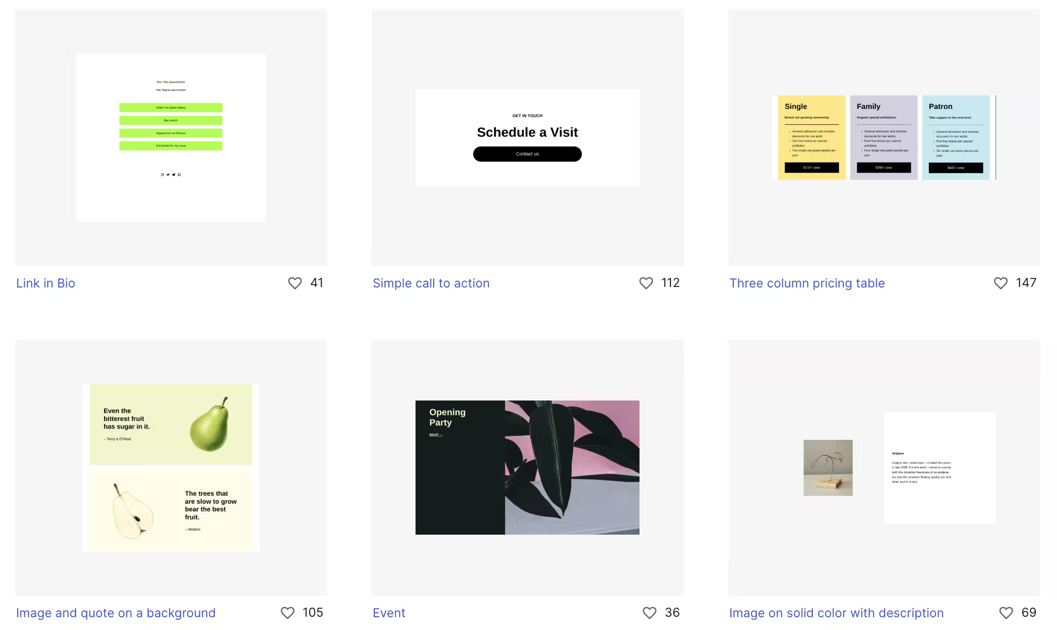
Well-designed patterns don’t limit creativity; they support it. By following proven layouts, spacing systems, and visual rhythms, you create harmony that feels intentional. Once that structure is in place, you can adapt, experiment, and let your unique style emerge with confidence.
If it’s not broken, don’t move it.
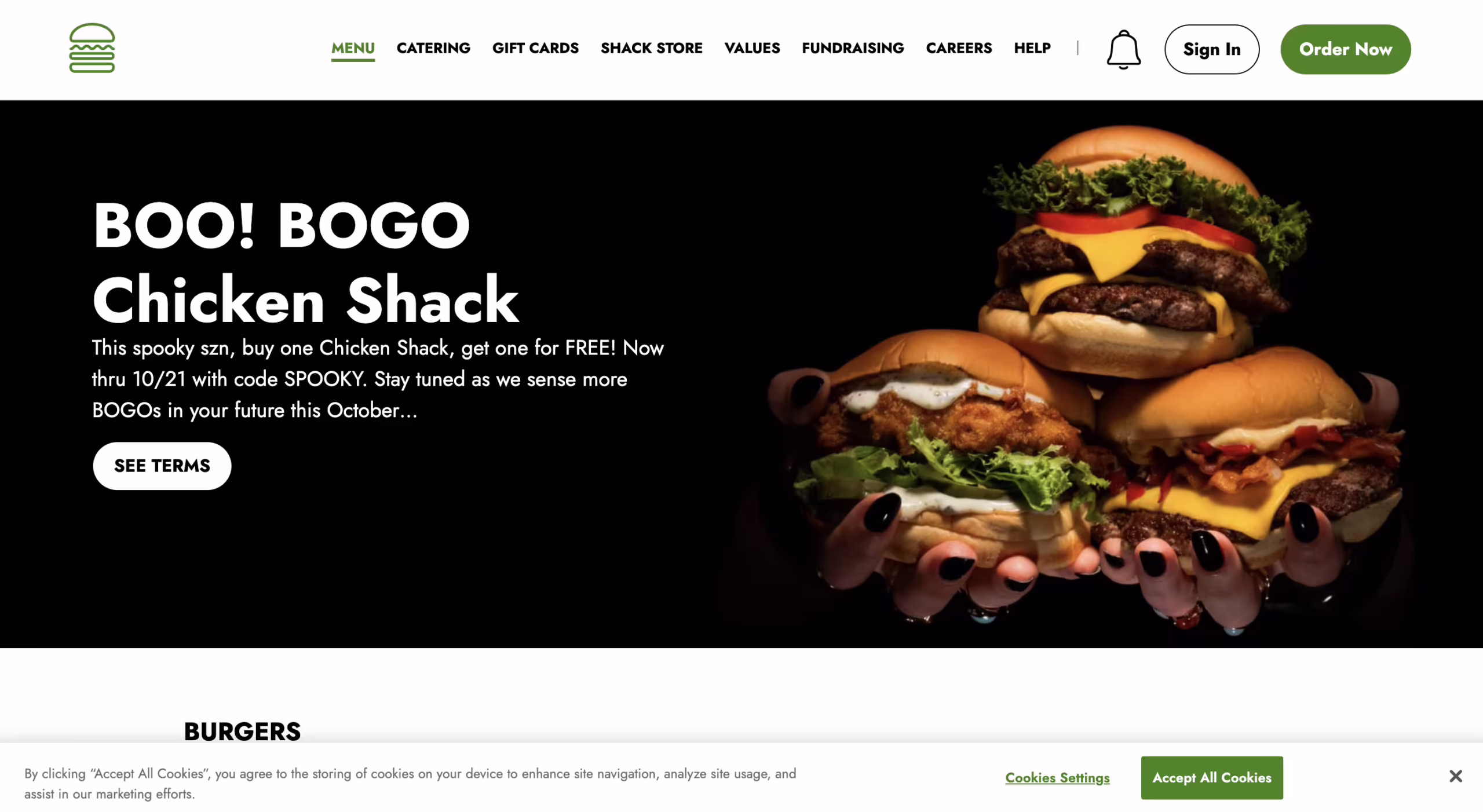
Use an accent color to make elements stand out
Set the accent color to something different from the primary color. The goal is to highlight elements, such as the background color of buttons, to make these calls to action stand out!
Whenever you list elements, use this accent color to make them noticeable and remind your users they are part of the brand.
Just remember not to overuse the accent color. If everything is highlighted, nothing will stand out.
Use a logo that is easy to read
If the logo is too small to read, increase its size.
You might be using a logo version in the wrong place. Is it too tall for a space better suited for horizontal layouts? This can create awkward empty areas.
Does the logo include a slogan? It shouldn’t, but if it’s hard to read, consider removing it or using a proper version.
Use good quality images
Even in these AI times, it can be harder to enlarge a small pixelated image than to downscale a larger one.
Does it look sharp? Does it look pixelated?
Is it too dark? If it is a photograph, is it well-lit?
Does it seem like part of the group?
A simple trick is to apply a filter to the images if they don’t look very similar. You could use one of the primary colors to help them feel like part of the whole.
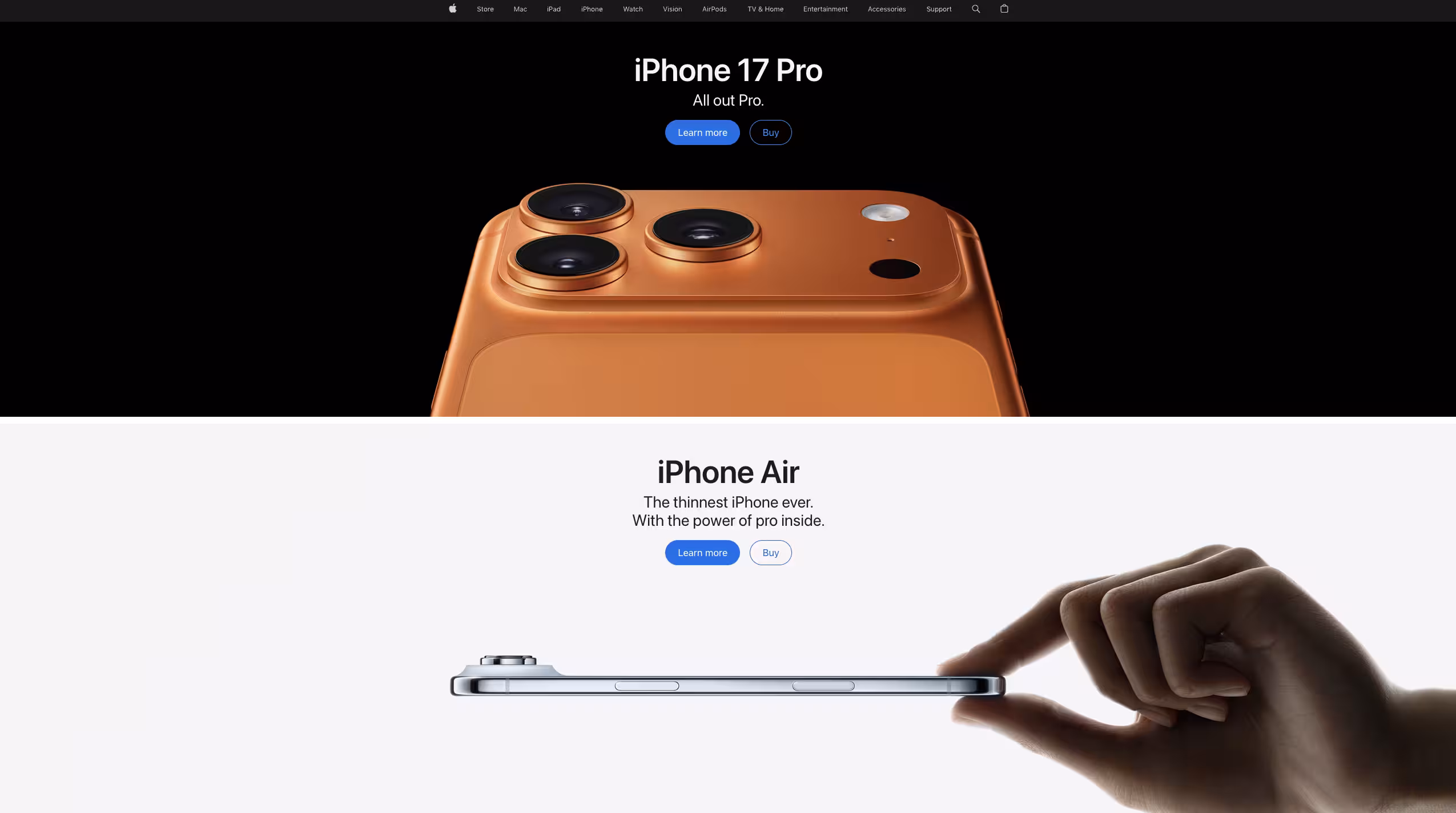
Dark or bright colors? Why not both?
Using dark colors can help reduce eye strain and make elements look more cinematic and dramatic.
White suggests openness, transparency, and minimalism, making it easier to read long texts on a bright background.
If you can use both options, that can be interesting. Big brands like Apple use dark colors for their iPhone Pro models and white for other products like the Air.
Let the elements breath
Think about proper spacing, padding, and margins. Don’t be afraid of emptiness.
Space makes text easier to read and helps the eye rest.
Whitespace directs attention and makes key elements stand out.
Spacious layouts look confident and elegant, like Apple or Chanel.
Clean designs feel organized, intentional, and trustworthy.
I hope this information helps.
Jos Velasco.
Leave a Reply