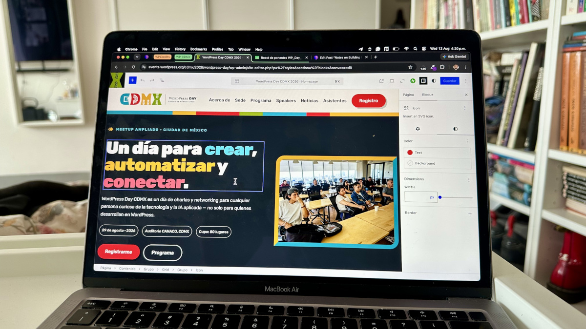
I think I’m getting the hang of building websites for WordPress events. My previous experience building the website for WordCamp Bogotá taught me a lot, especially the importance of a strong brand that the community can relate to and of preparing all the information in advance.
The cool thing is you will always learn something new, especially if you try the latest Gutenberg features.
There wasn’t much time to build this website, and there weren’t many hands on deck. The WordPress Day CDMX 2026 event is smaller than a classic WordCamp, so I made an early call based on other WordPress Day event websites I saw: put almost everything on the homepage.
The foundation: give AI everything up front
I gave Claude Design a try for this one. I dumped all the content into a single prompt. Most of the information had already been gathered by the community, so this step was easy:
- A reference to react against. I provided an existing WordPress event URL as a visual reference for the structure.
- The event’s core facts. Name, working title, date, format, venue, address, capacity, organizer, slogan.
- The ticketing logic. I explained the early-bird discount strategy so the design and copy could carry a sense of urgency and commitment.
- Who is it actually for? I broke down the audience segments: professional WordPress users, business owners, people curious about applied AI, students, and the broader Mexico City tech scene. That shaped the tone as much as the layout.
- The shape of the day, even with the exact schedule still pending — so the design could hold a TBD timeline and still look finished.
- A placeholder-ready speakers section, since the lineup hasn’t been confirmed yet. (I hid this section using the Core WordPress visibility option, so it couldn’t render on the front end.)
- Venue details, including what was still pending (transport/parking).
- The organizing team, for a credits section. Later, I expanded this structure to include the volunteers.
- Real “about us” copy for the community — origin story, tone, values — already written, so Claude could work with our actual words.
- Social links, including Meetup.
- Sponsors. I shared the PDF deck with the three tiers. The pitch, itemized perks per tier, an in-kind option, and the contact CTA.
- Community logo and branding files attached directly. I used these to have AI extract the palette and choose the typography, which should be Google Fonts to make things easier and use the Core functionality to import them.
- Explicit creative freedom. I said the final palette, typography, and layout were completely up to its judgment, anchored to WordPress’s official brand guidelines and the community style.
That one prompt got me a first design that’s remarkably close to what’s live today.
I asked it to convert the design into Gutenberg blocks, but it failed in some parts, so I asked it to convert it into HTML blocks instead, which I could then convert manually into Gutenberg-editable blocks. This way, I had the content in place with a visual reference on the site while I made the blocks editable so we could publish the site quickly and then make it easy to edit for everyone, which in reality was only me, but you get the drill.
By the way, take a look at this very interesting HTML option for making content editable.
The takeaway here goes beyond writing a longer prompt. What usually slows a site’s development down is clarifying what it should communicate and who it’s for. Once that planning is done and documented, AI can respond as fast as you can paste. I was asking Claude to shape an event I already knew well.
Extending the brand instead of re-inventing it
Once the core design was in place, everything that followed was an extension — and that’s where having a foundation really paid off.
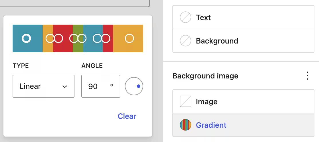
For example, when I needed a decorative color stripe, I gave Claude a working code example by copying and pasting the block markup for a simple three-color gradient block, which could be extended to more colors instead of plain HTML—a 7-segment header stripe (teal, gold, red, olive, teal, red, gold, in 3·1·2·1·2·1·3 proportions), converted into exact percentage stops with hard color breaks. Doing this in the UI would have been really difficult, since it is not designed for so many colors.
Same for the logo. When I needed a version for dark backgrounds, I referenced what already existed — “WordPress Day” and “Continuamos aprendiendo” in white, “en comunidad” in gold, the CDMX lettering cut out to show the folk-pattern background through it — and asked for a transparent, cropped variant of that.
And to add more details, I also got to try the hover pseudo-state for buttons to assign colors when a user hovers over them.
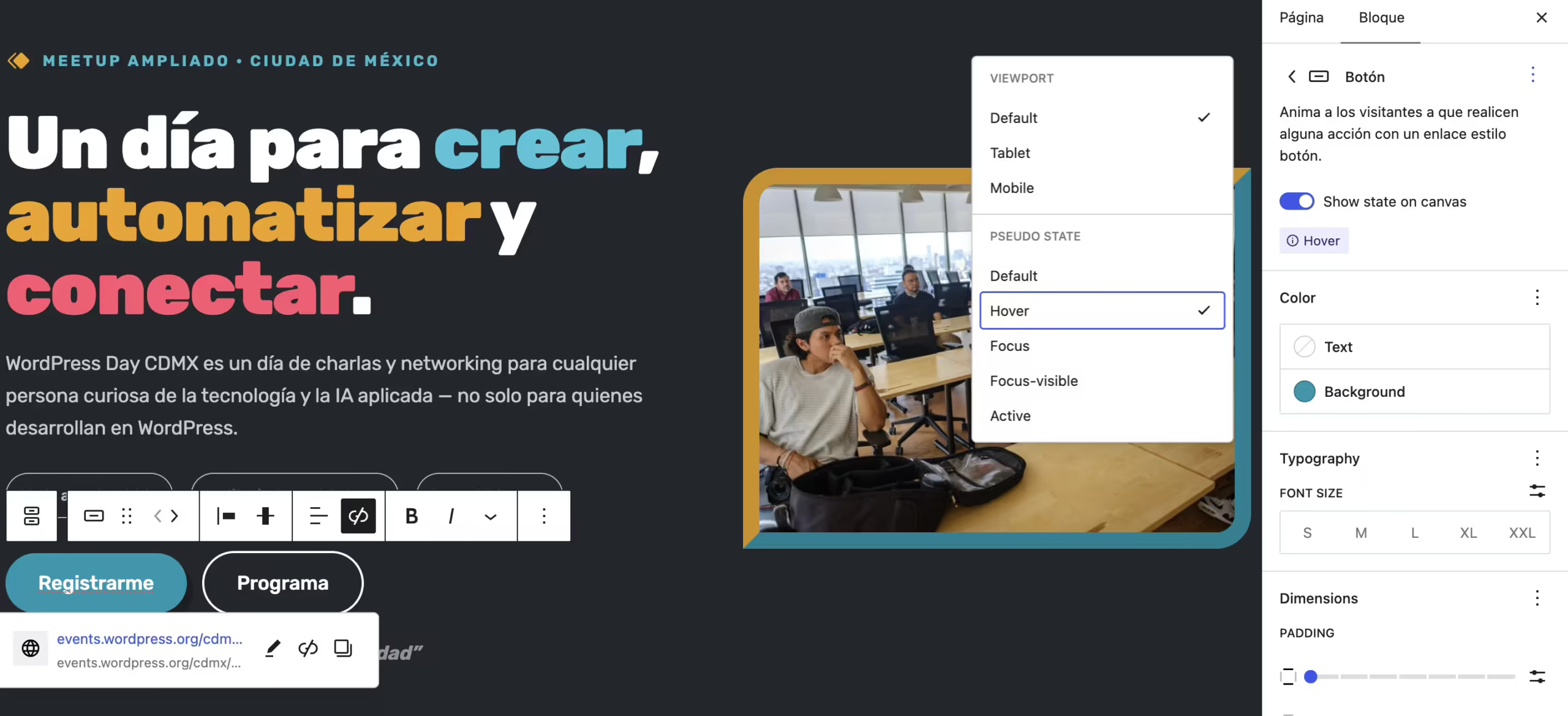
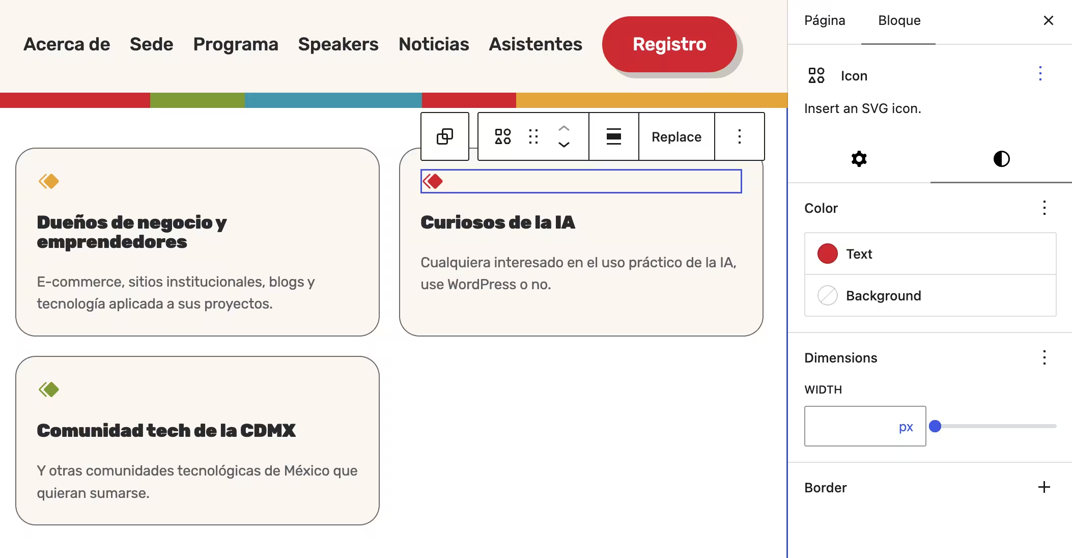
I also wanted to try the icon block to give it a touch. I’m excited about what’s coming, since this time I had to choose from the default library.
Styling the parts WordPress doesn’t let you design
Ticketing on WordPress.org events runs through CampTix, which ships its own default markup and styles. So this part of the process looked different: I pasted the actual rendered HTML of each screen as I tested the real checkout flow, and asked for CSS to bring it in line with the rest of the site.

The ticket selection table was restyled to match the established system: a cream background, Rubik typeface, the same teal/red/amber tokens used elsewhere, and rounded pill buttons — all implemented with CSS custom properties (–wpd-teal, –wpd-red, etc.) so the whole site pulls from a single shared palette.
The attendee registration screen — name, email, radio-button questions, and code of conduct checkbox — received the same tokens, so step two of checkout felt like the same website.
Most of the CSS I’ve mentioned so far went into the site’s global Additional CSS. I also tested applying custom CSS at the individual block level, scoped to a single block instance. For a one-page site like this, it was optional but worth trying: on a larger, multi-page site, block-level CSS lets you make a one-off styling exception that stays contained and keeps your global stylesheet free of rules that apply only once.
Why this might matter more than the design itself
The site feels like its own thing. It’s clean, it’s organized, and everything — the ticket table, the sponsorship section, the call-to-action section — shares the same visual language, down to the exact gradient technique repeating across the page.
For a volunteer-run community event with a small team and almost no lead time, consistency builds trust. A site that looks intentional signals that the event is intentional — that someone thought it through, that the organizers are credible, and that a $5–10 ticket is a safe bet.
I think that’s part of why tickets moved as fast as they did. People decide whether to trust the page asking them to pay before deciding to attend. A site that feels considered — with the same colors, same type, and same logic from the homepage through checkout — removes friction.
So if there’s a takeaway for other organizers or freelancers considering using AI for a project like this, the speed comes from knowing your brand well enough to hand it over and from treating each new piece as an extension of what already exists. Give it a real foundation, and it moves fast.
Where this could go: teaching this to the next generation
This whole build also got me thinking about WP Credits, the program I mentor through. Right now, WordPress.org is defining a developer-focused track for it — a 2–3 tier path from beginner to advanced, built around real contributions (WPCredits-Tracker #141). I think two projects map onto that pretty naturally, and each one uses AI differently.
Tier 1, beginner: my mentee is currently working on accessibility and usability improvements for the Beenova Campus Connect 2026 site — alt text, heading hierarchy, color contrast, keyboard navigation, replacing placeholder content — entirely inside the Site Editor, using core blocks, staying within Twenty Twenty-Four (Community-Team #1071). It’s a solid entry point: a real site, real constraints, and it builds fluency with core blocks and accessibility fundamentals from the start.
Tier 2/3, intermediate–advanced: the WordPress Day CDMX build above — a full brand system, custom gradient tokens reused across sections, a CampTix checkout flow restyled to match the brand, debugging real theme-CSS specificity conflicts. That’s a different skill tier: designing a system.
If I had to suggest one axis for a curriculum like this, it’s where AI enters. Tier 1 could stay AI-free on purpose, building real fluency with block editing, theme.json, and CSS specificity first, the way my mentee is doing right now. A later tier could introduce AI the way I used it on the CDMX site: as a multiplier once you already understand what you’re asking for and can debug what comes back.
The value in this whole exercise came from already knowing WordPress well enough to direct, correct, and extend it piece by piece. Teaching that judgment first and layering AI on top of it later seems like the right order for anyone coming up through a program like WP Credits, too.
Leave a Reply